April 16, 2023, 1:01 pm
Background
The Children’s Media Conference’s activities culminate in the annual event of the same name. It attracts delegates from across the industry, across the world – from film, TV and radio, to interactive media, games and licensing – to meet buyers, potential business partners or clients and share insights through networking opportunities and information exchanges.
Our creative approach
Successful event branding has to tread a fine line between re-engaging existing audiences already familiar with who you are, what you do and how you do it – with the need to reach newcomers who perhaps might be unaware of your influence or significance within the industry.
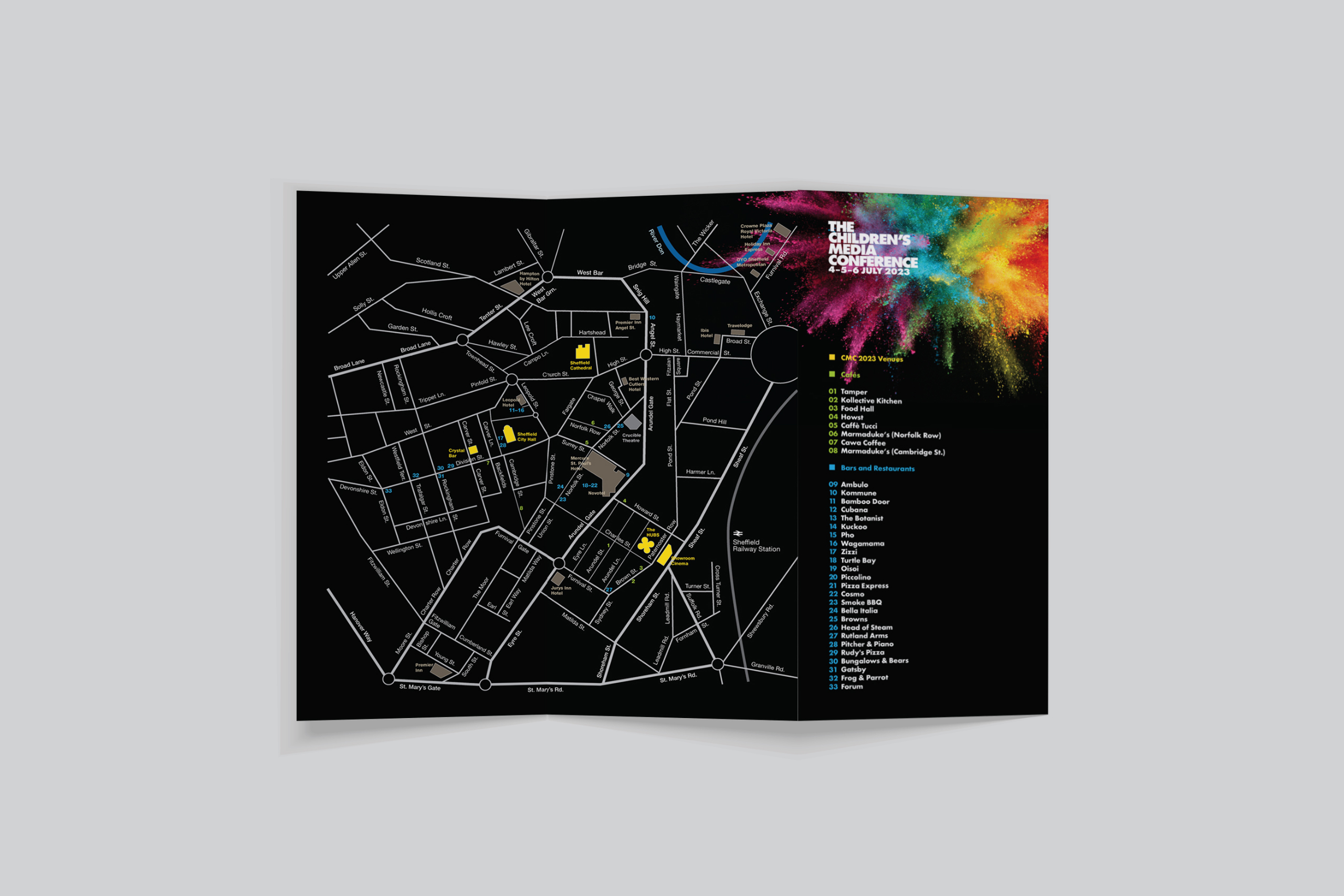
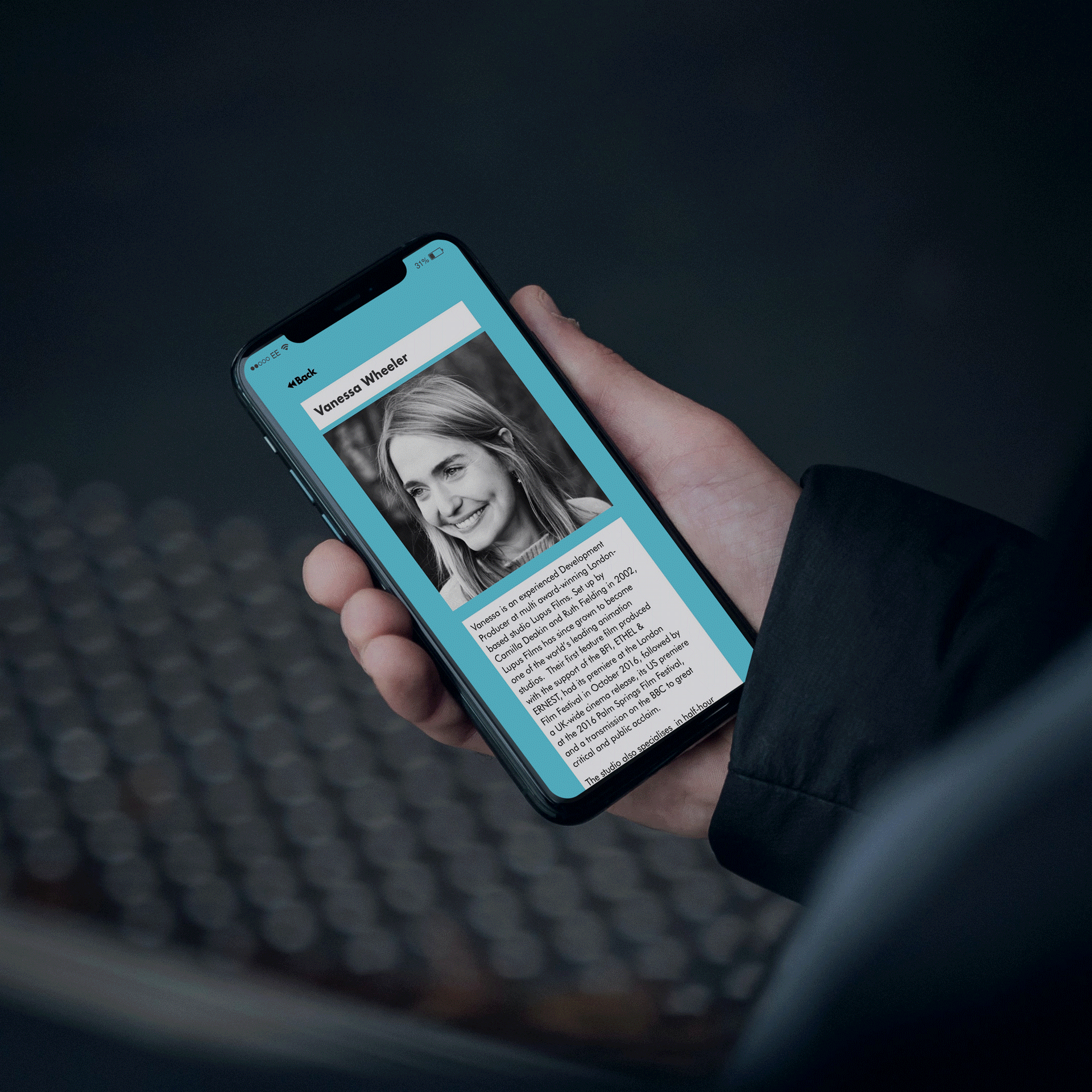
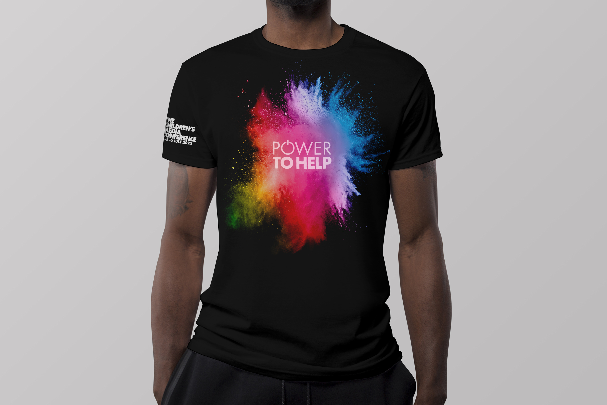
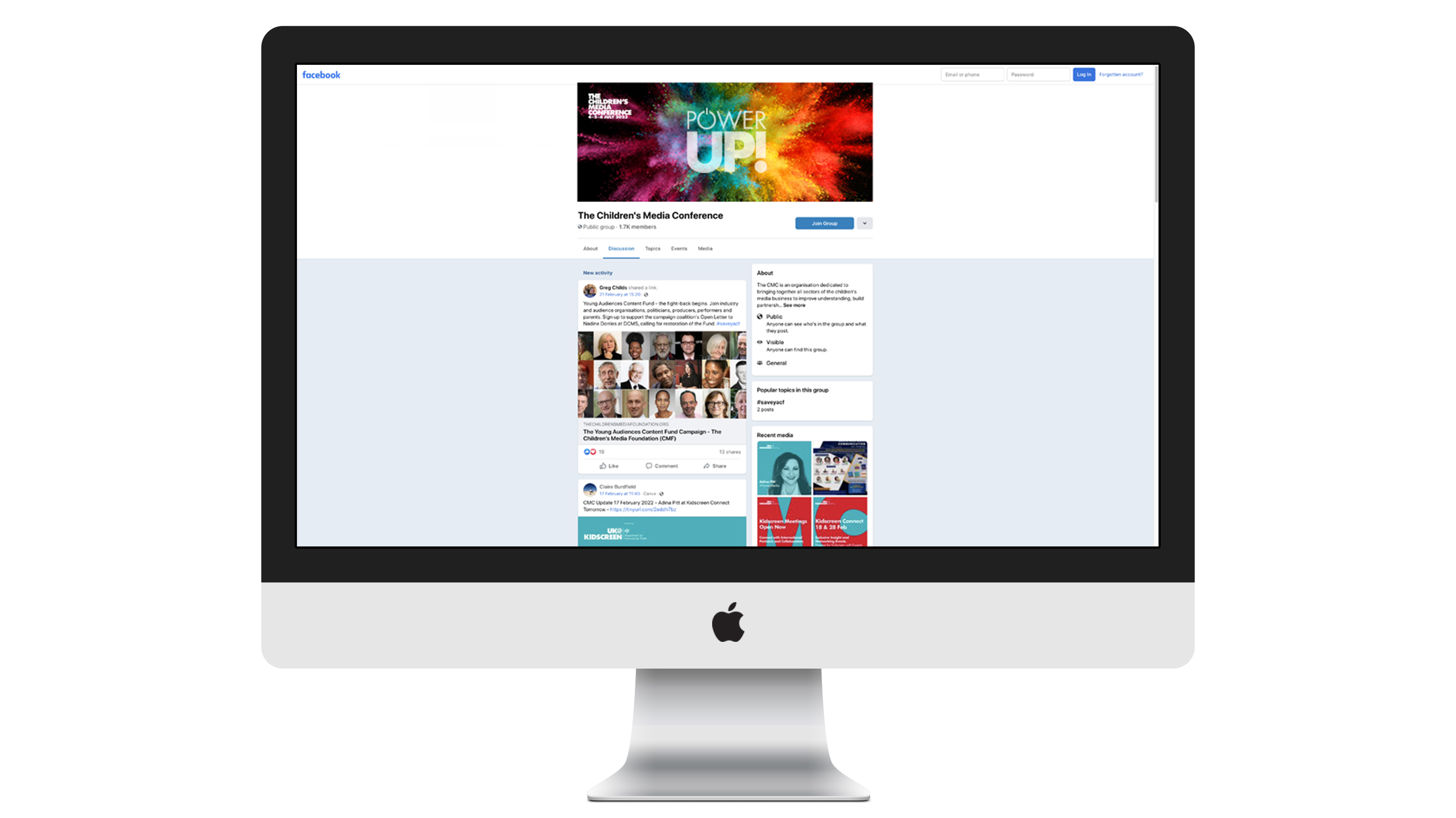
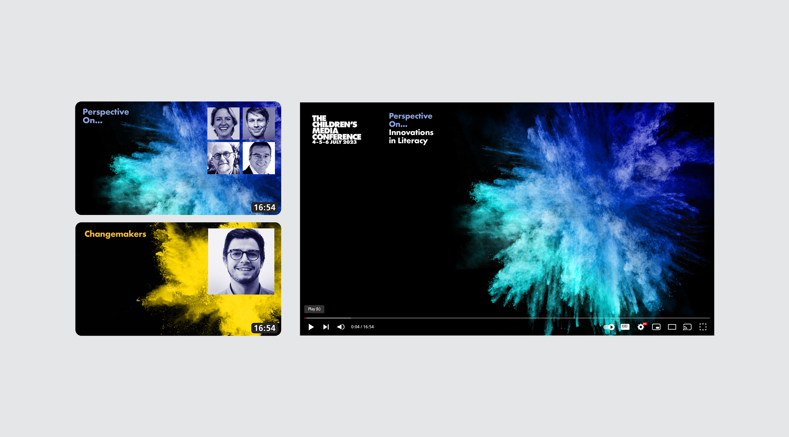
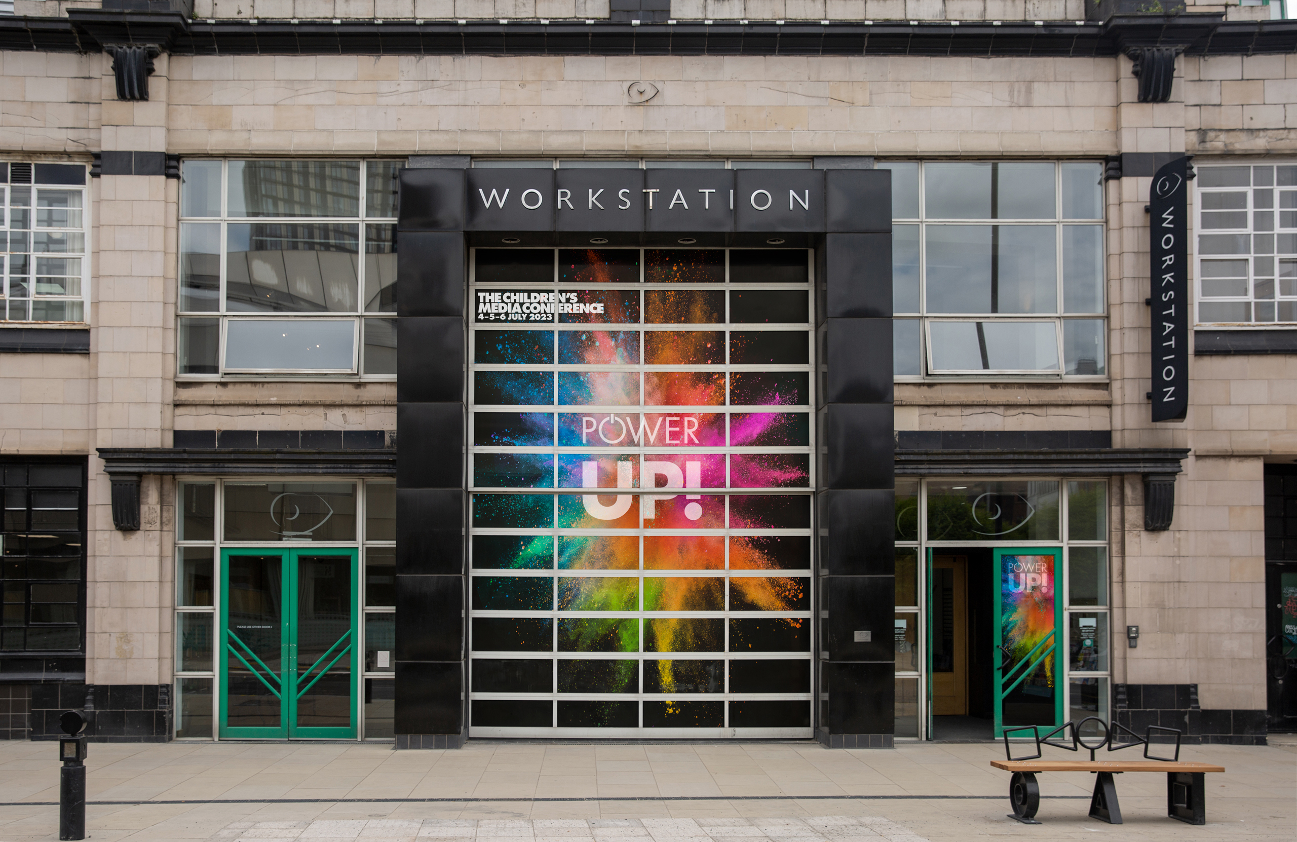
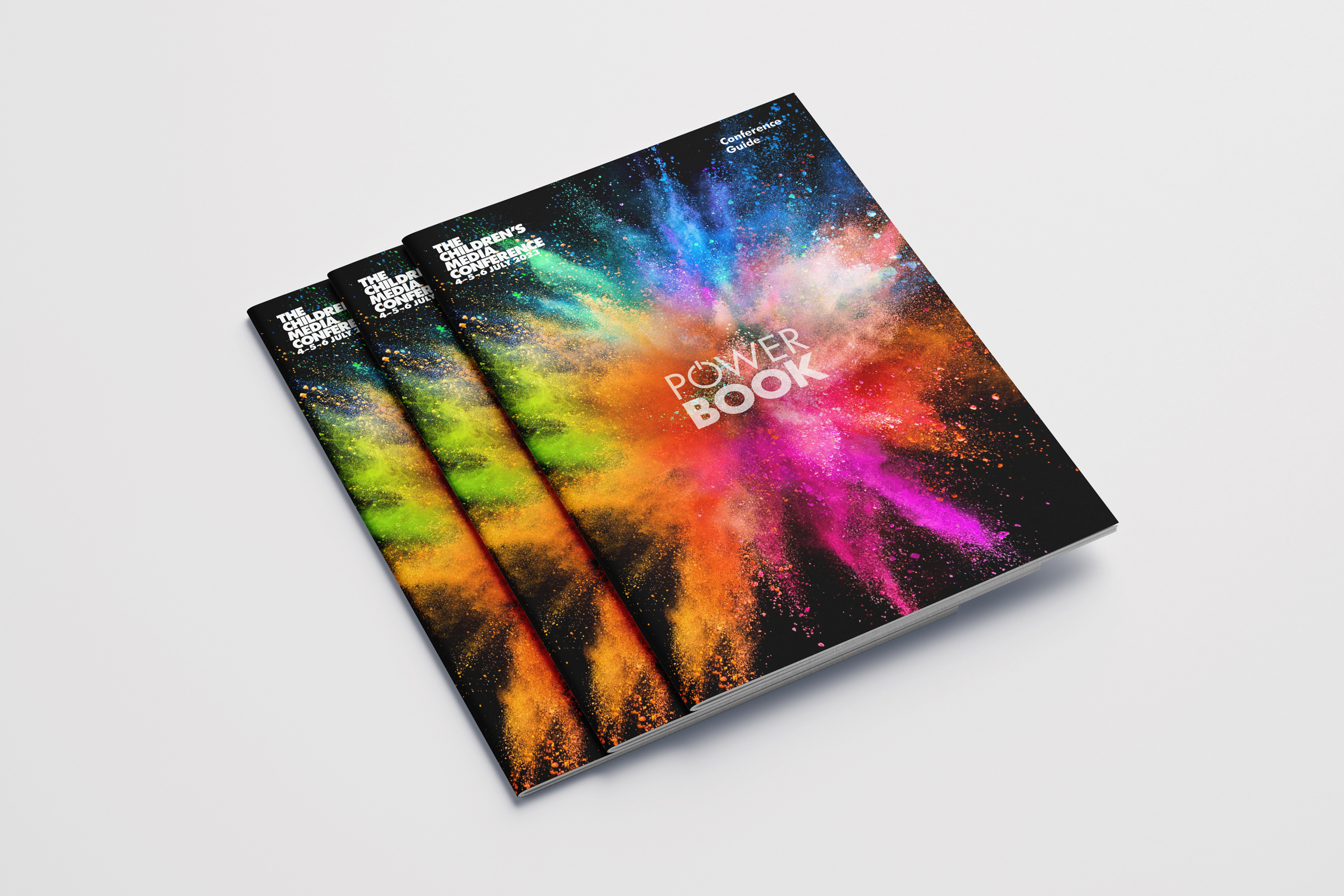
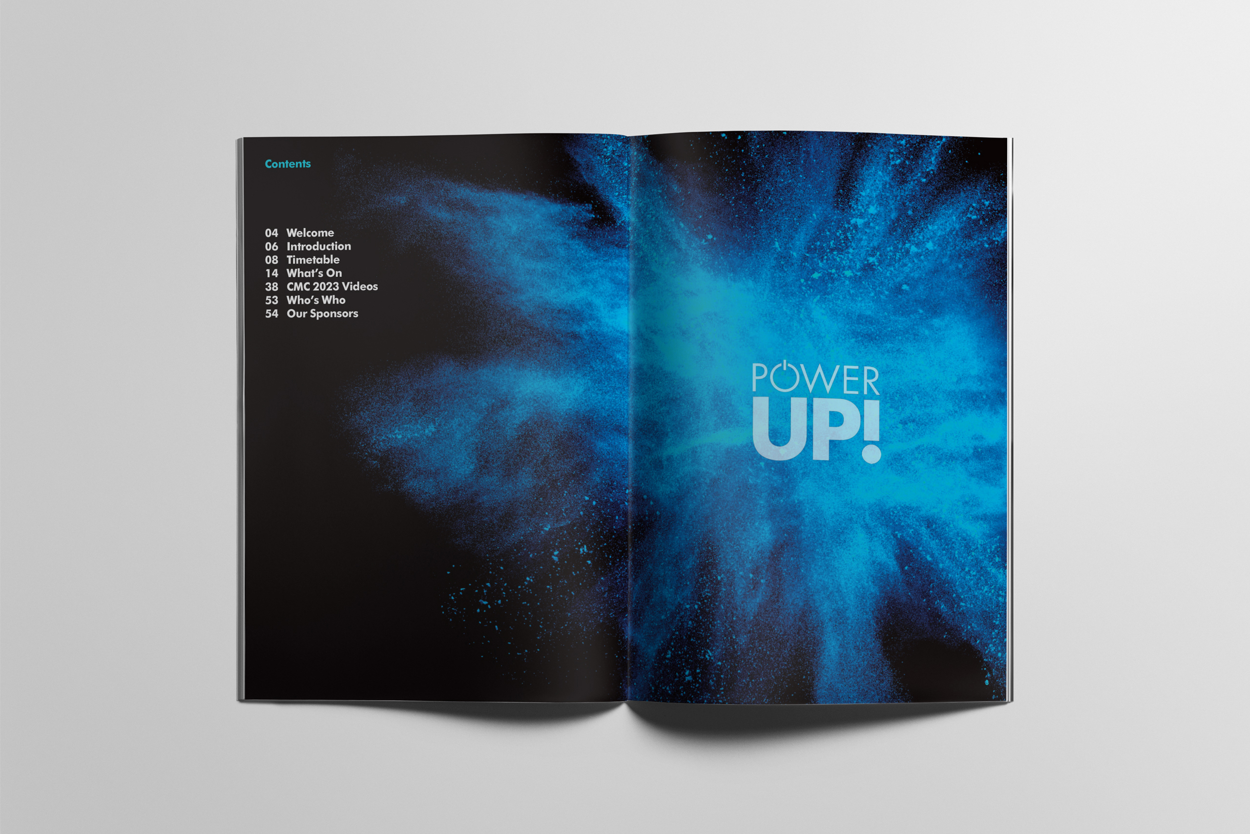
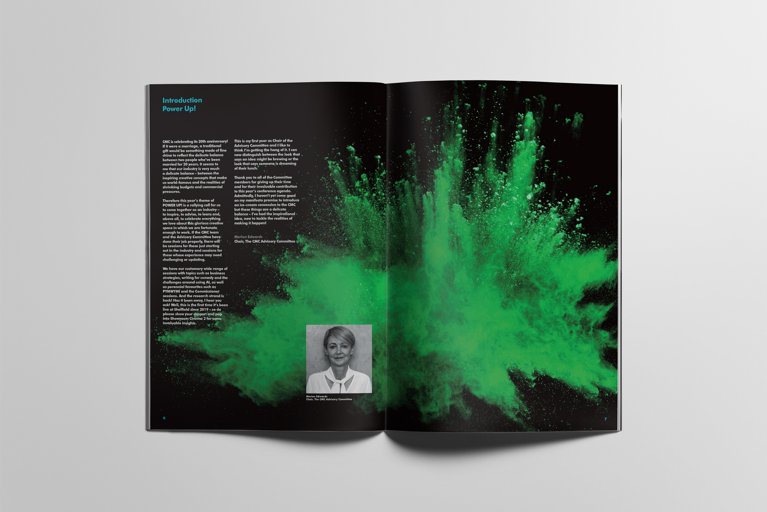
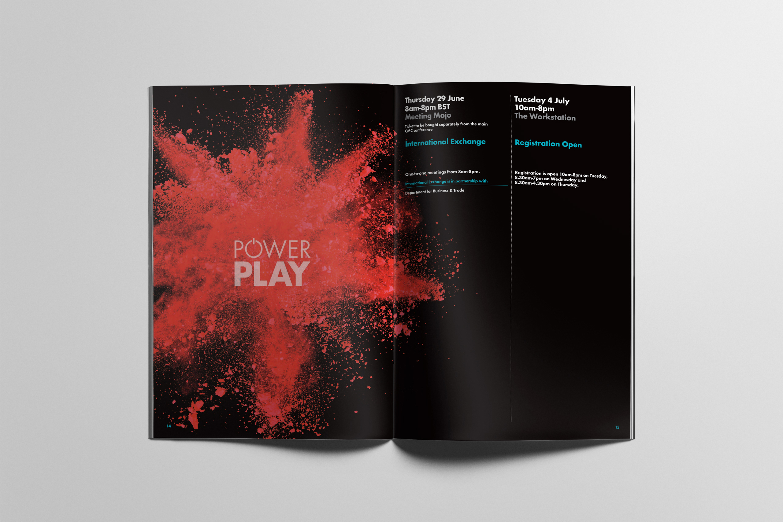
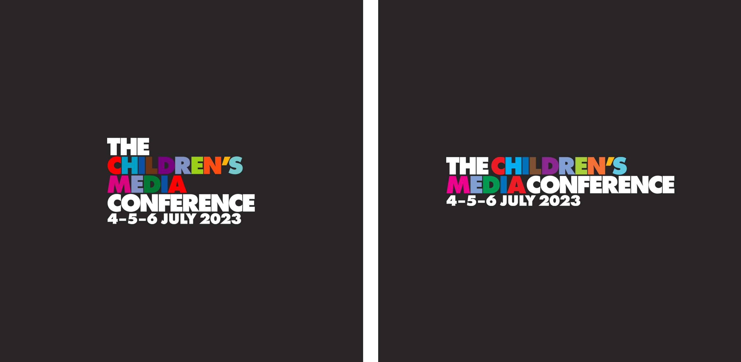
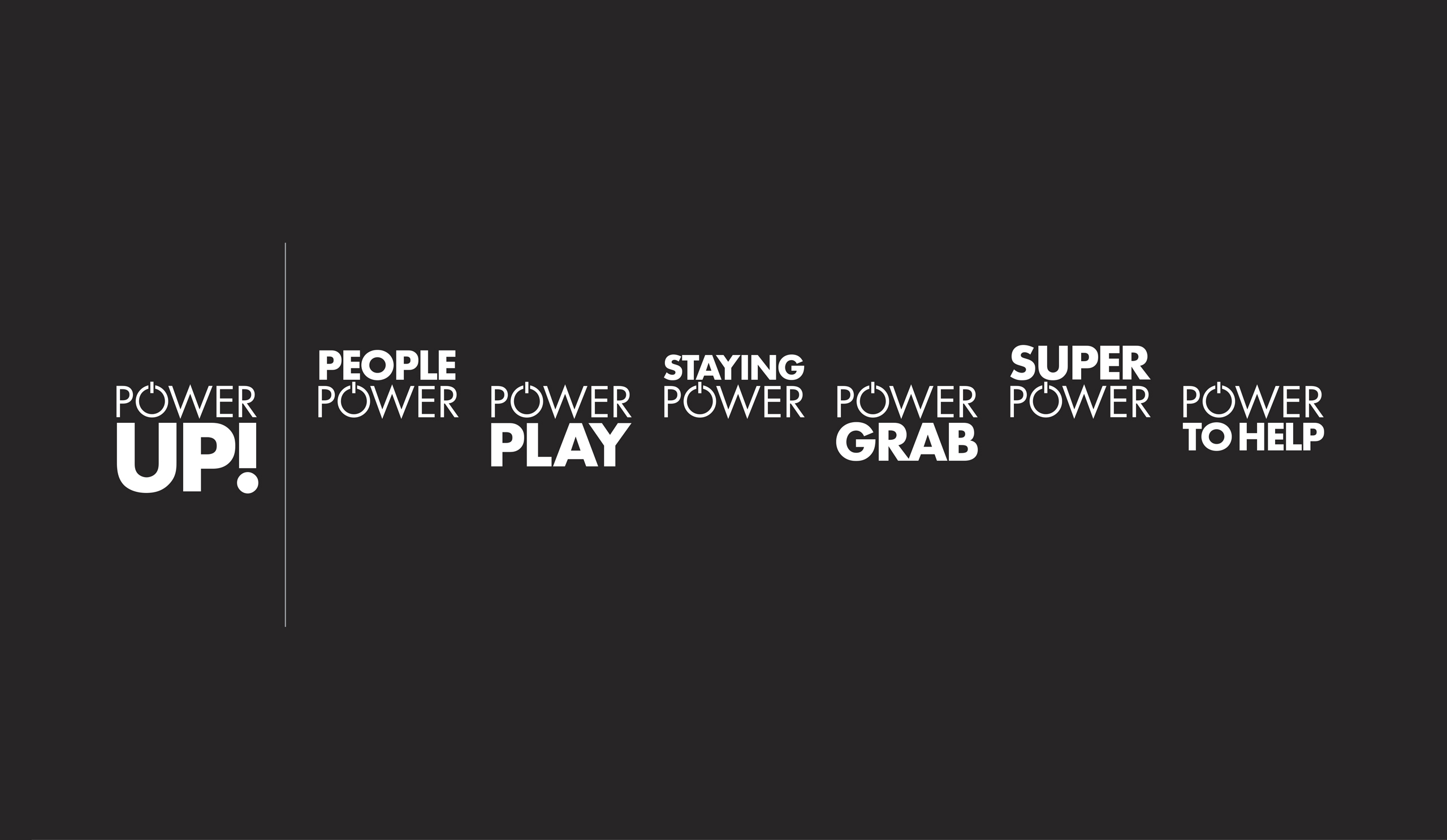
TruthStudio have branded the CMC event every year, for the past 14-years. It is the largest, most important International live event for anyone involved in content for kids. In early 2023 CMC announced their conference theme: ‘Power Up!’
We proposed the ‘colour splash’ to express the power, energy and impact of the return of the 2023 Conference as a fully ‘live’ event – following the preceding 2-years of restrictions to public gatherings, due to the covid pandemic.
Results
The 20th conference in 2023 attracted over 1,000 delegates from across the children’s industries – and from a range of countries worldwide – the largest attendance post-covid. The Conference App had the most downloads of any previous year. The vibrant and consistent branding we created across all areas of the event was crucial in raising CMC’s international profile and contributed to its offer of great content, great networking opportunities to meet buyers, potential business partners or clients.
Category: |
Comments Off on The Children’s Media Conference
April 16, 2023, 12:52 pm
Background
#StreetArtHeroes was conceived and curated by Garry Hunter at Fitzrovia Noir Community Interest Group. Over eighty days, a dozen urban artists from around the world brought their unique vision to the north of the Wear and south of the Tyne, leaving permanent artworks for everyone to access and enjoy.


Our creative approach
In addition to creating a strong, evocative over-arching logotype for the project, TruthStudio were commissioned to produce an easy to follow way-finding system which would help people locate and navigate the 30 installations across the 20 locations in the region.
As part of our research we visited all 20 locations across all seven districts of the South Shields and Sunderland region – from vast warehouse walls in St Peters, beach shelters in Roker to farms and old quarries in Marsden. We then carefully mapped the areas in detail – complete with a colour coded key system, local transport links, street networks and landmarks which covered all the installations.
Results
The completed project was a series of seven beautifully designed and printed, pocket-sized guides which were enclosed in an outer slip-case. The guide booklets were designed to be removed and replaced individually – so the user needn’t carry the whole pack if only visiting one location.
The guides provide biographies of each artist, a short summary of the location and brief synopsis of the individual artworks to be discovered there.
Category: |
Comments Off on Cultural Spring
April 11, 2023, 9:58 am
Background
Publicising a new event – one that didn’t exist before – can sometimes be tricky. There are no images of it, because, well, it hasn’t happened yet. It can all be a bit ‘chicken and egg’. How do you engage and enthuse your potential audience of its vibrancy, energy and fun without showing the exciting pictures? That was the challenge faced by First Art when they devised ‘Bolsover Stories’ – a weekend festival celebrating the stories of Bolsover town in Derbyshire – when they asked TruthStudio to design and create an identity for it.

Our creative approach
We have a secret weapon. It just so happens that one of our superpowers– and our passion – is typography. And, with this brand new event being about storytelling through specially commissioned, community arts events, such as outdoor theatre and poetry workshops, it was just our type.
The event title spoke to us immediately and we recognised the creative potential in the words – particularly the two letter ‘O’s. Like open mouths, they were crying out to be at the heart of a unique, distinctive, and memorable typographic led idea! We developed a dynamic typographic combination for the event title which we applied across all the aspects of the festival – Performances, Workshops, Movies, Poetry and Community Activities. This distinctive and flexible identity was then expanded and implemented across all visual collateral we designed for the event – from publicity posters and banners, to online publicity and our large format, fold-out Bolsover Stories Event Guide.
Results
The event was a resounding success for First Art. It brought the tight-knit community of Bolsover together, attracted tourists from the wider region, and boosted revenue for local businesses across the town. We like to think our witty, colourful and unique event branding and wayfinding went some way in making it an unforgettable weekend.
Category: |
Comments Off on First Art